Tuesday, October 29, 2019

GISDay Poster

Week of October 29th

With GIS Day coming up at Purdue University, a poster highlighting 3D modeling in Multipatch and Pix4D is being created to submit for the event. Last week, each team in the class showed their rough draft poster to be critiqued and improve. Below is each students suggestions and how the poster was revised based off said suggestions.

Key: 
  • Suggested change to the poster
    • Poster change made
Hupy:
  • Rename Pix4D
    • Changed Pix4D name to photogrammetry software
  • Change arrow color
    • Changed from a yellow arrow to a black box outlining the picture of background noise
  • Explain photogrammetry initially and what kind of software
    • Explained how photogrammetry software is used to generate structure from motion, multi-view-stereo 3D models
Jasper: 
  • abstract center
    • Abstract was placed in the top left 
  • Move pros boxes down for more space 
  • All caps on abstract. SATT logo messed up
    • Fixed the abstract so it is no longer all capitalized and SATT logo is no longer distorted
  • Adding space down the center of the page
    • Centered the page up better for uniformity 
  • Bottom line up is offset
    • Bottom line is no longer offset
Sam:
  • Black border around the poster
    • Did not end up doing a black border around the poster
  • Label model figures
    • Did not end up labeling model figures as it is explained within the text next to each model
Alan:
  • Box for round barn zoom up
    • Added a black box around the round barn zoom up
  • Make it flow better
    • Lined up Multipatch and Pix4D so the poster flows better and is easier to understand
Luke Hull:
  • Switch the whole poster
    • Made the poster readable form left to right for better flow
  • Better layout
    • Improved the layout for better flow
Ryan:
  • Better layout. Each one is a couple pixels off
    • Improved the layout for better flow. Improved the designs on the poster so they line up evenly
  • The gold bar at the bottom of the page
    • Fixed the gold bar to line up evenly
  • Remove text boxes or line them up better
    • Ended up removing most text boxes for a cleaner look
Connor:
  • Balance the poster
    • Balanced the poster for a cleaner look and better flow
  • Just have pros and cons of both
    • Ended up splitting the pros and cons by which software is being talked about for easier understanding
  • Center multipatch in the poster
    • Ended up putting Multipatch at the top of the poster rather than centering it

  • Highlight the area zoomed in on for building

    • Put a black box around the zoomed up picture to make it easier to notice
  • Question and overall title contradict each other
    • Kept the title and question the same
  • Abstract is dense
    • Kept the abstract the same, not able to condense since it is covering a lot of information 
Tim:
  • No text boxes
    • Removed text boxes for a cleaner look
  • Format top down
    • Ended up formatting top down
Luke Mklar:
  • Boxes don't need the borders
    • Removed the text boxes for a cleaner look
  • Photos in the center doesn't work
    • Left the photos in the center and evened them out on each side
Jarrett:
  • Messy and inconsistent
    • Cleaned up the layout for a cleaner look and easier to understand
  • Line up the text boxes better
    • Removed text boxes for a cleaner look
  • Use the Purdue official colors
    • Purdue official colors were too dark, used a slightly lighter color
  • Flip the top 2 so multipatch is on the right
    • Multipatch is on the top while Pix4D is directly below.
  • Arrow is cheap. Use inset lines instead
    • Added black box highlighting the zoomed in photo instead of the arrow

Below is the final poster that will be submitted for GIS Day. Most suggestions were taken into consideration vastly improving the quality of the poster.

Tuesday, October 22, 2019

GIS Day Poster Rough Draft

Introduction:

We have prepared a thorough rough draft for the poster we are presenting on GIS Day.  The abstract was positioned in the top left corner so the viewer focuses there first.  Below the abstract, we detailed the pros and cons for each method of creating 3D models.  Then next to this we have created a table to illustrate the different times that each phase took to complete.  These phases include post-processing, processing, and data collection.  After this we included the 3D model results from the Multipatch and Pix4D.  Next to the models we made sure include brief descriptions of the software and how it was used. The features of the poster at the bottom are still in the process of being created and we have used placeholders for what it could look like.  This is one of the final deliverables we need to finish before making the final poster.

Advancements:
To ensure the best possible accuracy and quality from Pix4D, the model undergone post processing. Ground control points (GCP's) were added for accuracy and masking was done to reduce the clutter. masking was done to the 3D model to get rid of background noise.
Pix4D Model Before Post Processing 


Reducing the background noise helped improve the overall quality of the model, however, it took an extra 28 minutes which is a crucial amount of time.
Pix4D Model After Post Processing

The office building in multipatch was also improved to better the overall quality. One continuously arising issues with multipatch is that it is glitchy. Shown in the picture below, the red "editing" color on the back side of the roof would not go away. Furthermore, it sometimes does not allow for the multipatch to be edited.
ArcGIS Pro Multi-Patch Model
Work Done this week:
Our team increased our level of understanding in CAD software, and the post-processing of 3D models and we recently found out that Multipatch may have post-processing that allows for features that cannot be added in ArcPro. There will be more to come on that as we figure out the CAD software, stay tuned.


Weekly Overview:
We made large strides this week in our overall knowledge off 3D modeling and the multiple different software available to make the process more efficient. My personal knowledge of Fusion 360 is increasing exponentially. I am following a course on the program from the fusion 360 website and also getting tutored on how to use this program along with CATIA.

Tuesday, October 1, 2019

Week of Oct 15 2019

Introduction:

This week involved more advanced features in Multi-patch and the beginning of the creation of everything we will use for GIS Day at Purdue. We collected more data at the Purdue Beef  Unit, this data is non-rectangular so it will challenge the Multi-patch software and our team to see if creation of these models are still easier than the standard 3D modeling. For GIS day, where numerous industry professionals will come to Purdue to look at the work that researchers are putting in, we started creating a poster portraying what Multi-patch can do.


Adept Skills in Multi-patch:

At the Purdue Beef Unit, we focused on non-rectangular and buildings with convex roofs. This will allow us to work increasing our skills in Multi-patch creation and to analyze if these intermediate buildings are still done easier versus doing them in a basic 3D model in PIX4D

Convex Roofs in Multi-patch
The roof was very easy to separate and pull up the convex sections, but our one failure of the data collection was that we did not gather the dimensions yet, so the convex roof points were done on a freehand basis.


Convex Roofs in Pix4D
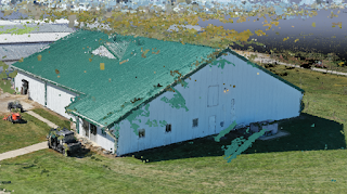
The pro of the creation of the Pix4D model is that the roof overhang on the sides of the building is shown in 3D versus just being an imported photo. The downside is that the noise on the model has messed up the sides and the roof, leaving it looking patchy at points

The timing of the collection and the processing still points to Multi-patch being superior. Below is a breakdown of the timing.


GIS Day Poster Template:


The main things that we tried to focus on for this template creation were based off of how the human eye will normally interpret things. Western language speakers will naturally read left to right, then top to bottom. Using that information, we put our research question and abstract first, so immediately the main point would be read. Right under that we put our comparison of each of the software packages, this puts all vital information nearby. On the right of that section, Multi-patch and PIX4D analysis are listed. Again, since the human eye reads top to bottom, the Pros of Multi-patch will be seen first and interpreted as superior. Below that section are the section for importing and exporting from Multi-patch. This is listed as importing on the left and exporting on the right to flow easily with the reader. More work will take place as time goes on, but this is the start of presenting our data.


Class Poster Creation:

Our class was assigned  to create a poster to be placed in the hallway of the Purdue Niswonger Building. We were allowed to create the poster using any topic and focusing on any audience of our choosing. Once we decided that our audience would be parents, prospective students, and current students, we decided that the topic should show off why Unmanned Aerial Systems is an upcoming and relevant field. Because of this, we were able to use data collected from our capstone project with 3D modeling along with a focus on High Resolution Imagery, GIS Data, and Search and Rescue.


My Contribution:

For the design of our new class poster I was vetted and selected as project manager, in charge of the entire Unmanned Areal Systems capstone department. I was less of the small hands on stuff and was tasked with designing, finalizing, and printing. Keeping everyone on task was quite easy, because I just let them know that the sooner we get this done the sooner we could leave for lunch! We broke off into two groups, one to go take the fleet picture, and one to build the actual poster. The overall construction of the poster went smoothly once we decided on the poster outline it was smooth sailing.